Visualizing Space
November 2021
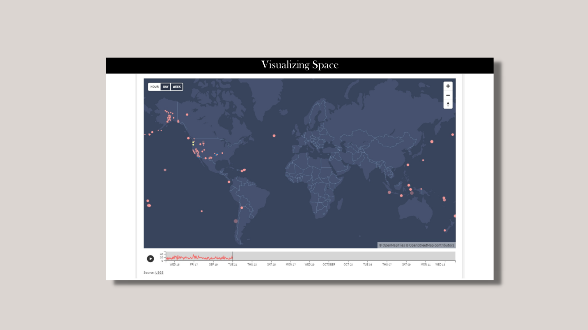
This was the last exercise of the Visualize series and maybe my favorite one! We were tasked to take earthquake dataset from USGS (1-hour, 1-day, 7-day, or 30-day) but to finally turn it into an interactive map visualization! It was up to us whether to use the same dataset we used in exercise two or to pull a new dataset. Our visualization had to reflect current earthquake activity in terms of magnitude and recency. Some questions that we were challenged with included:
Are you intending to visualize event level data, aggregated data? Based on your goals, which type of map best best represent your data?
How might your audience be invited to interact with the map? What additional context could interaction create?
Could you bring a temporal element into this investigation?
Type: Interactive data visualization
Tools: Excel, Flourish
The Process
I took the same dataset that I used for Visualizing Quantities, Categories, and Summaries to create this visualization. Out of all the interactive options that I could find with Flourish and Carto, the one that interested me the most was this interactive map that would allow users to play or pause the timeline of earthquakes occurring. Users could then zoom further into the map, hover over any circle, and see details of the event (type, magnitude, and date/time). The sizes of the circles indicated the magnitude, while the colors of the circles indicated the types of seismic events. If I could make further changes, it would be to include a legend of the sizes and colors of the circles but unfortunately I wasn’t able to. Overall, this was one of the most fun visualizations for me to try! I had never created a map visualization before.
What I Learned
I really loved playing around with Flourish! One of my strengths as a data visualization designer is creative a narrative and storytelling, so sometimes that means I don’t have enough time to code a project to pixel perfection. Having tools like Flourish allows me to quickly prototype and customize an interactive data visualization with a learning curve that’s less steep than coding. If I could do this project differently, it would be to share it with others for feedback and make changes such as including a legend and slowing down the animation. Overall, I really enjoyed this project and was happy with how the prototype turned out!
