Visualizing Time
October 2021
During my first semester at Parsons, I was lucky to take a course called “Data Vis and Info Aesthetics” taught by Ashley Treni. I couldn’t have picked a better foundational course especially since I never had any formal classes in design. This course focused on information design and aesthetics where we studied “graphical theory, graph grammar, and investigate hierarchies, patterns, and relationships in data structures.” We also examined “the role of scale, proportion, color, form, structure, motion, and composition in data visualization.” The “Visualize” series was a set of four design exercises throughout the semester to help put our design theories into practice.
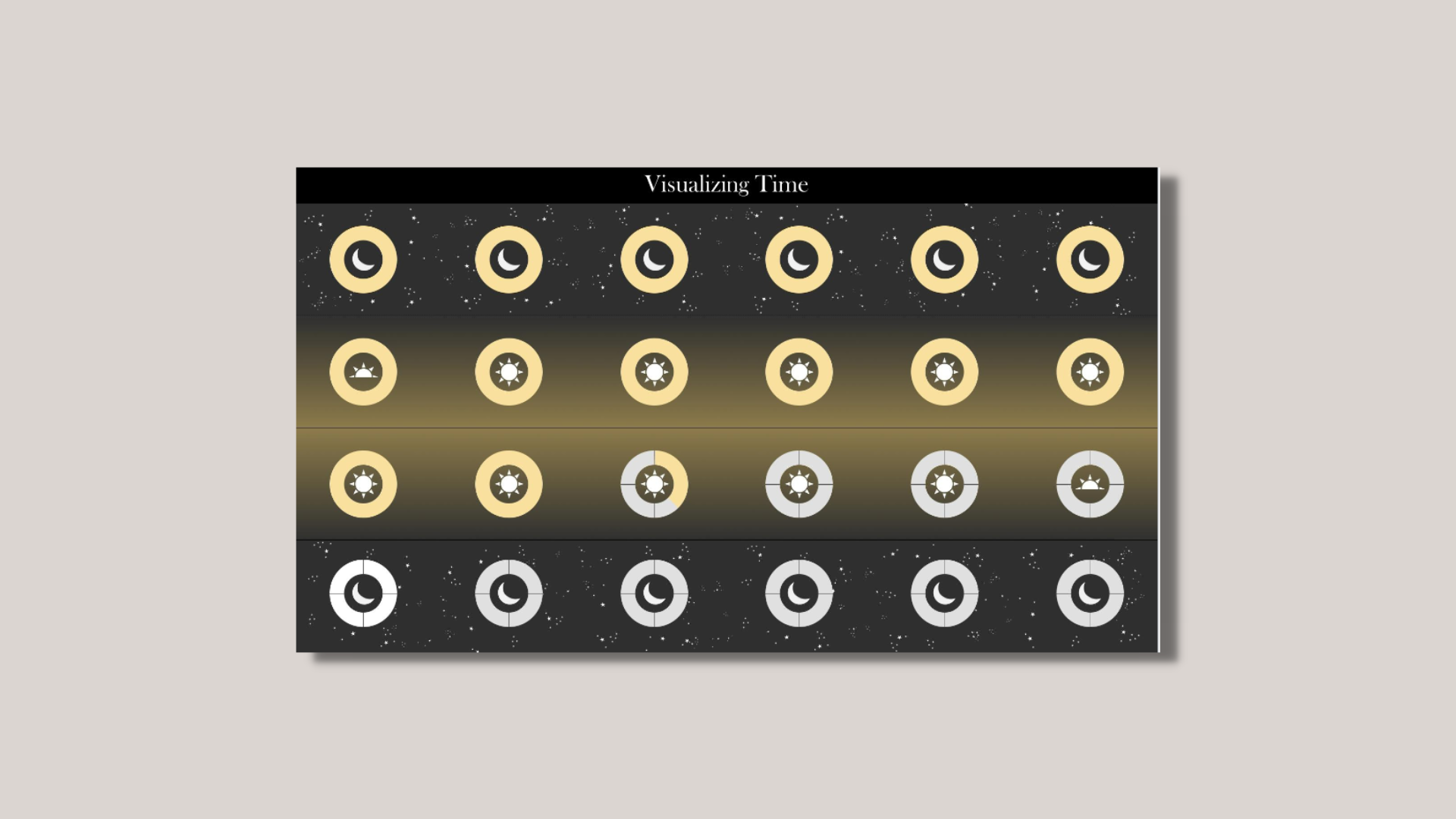
Our first exercise was to visualize time. The goal was to “design and implement a ‘visual clock’ that displays a novel or unconventional representation of the time”. We were free to question how time is represented, learn about the history of timekeeping systems and/or devices, and explore concepts like “biological time (chronobiology), ultradian and infradian rhythms, solar and lunar cycles, celestial time and sidereal time, decimal time, metric time, geological time, historical time, psychological time, and subjective time”. The catch was that were not allowed to use text or alphanumeric characters, only graphic primitives and symbols. 😅
Type: Static data visualization
Tools: Figma
The Process
After researching different concepts of time and the history timekeeping systems and devices for this exercise, I was eventually drawn to visual timers that I had seen in classrooms and offices. The bold color of time ticking away is universally understood even if you erased the numbers from the timer. Initially, I sketched out a 4 x 6 grid of donut-shaped timers for each hour of the day. Each donut had line dividers to signify quarters of the hour. As time passed, a bold color would “fill” in the donuts and erase the line dividers to show the passing of time.
But how would people know which hours was during the daytime or nighttime? Lunar calendars and cycles inspired the next iteration of design.
I love that moon calendars can succinctly show the seasonality of lunar cycles over an entire year on one page. I applied the similar approach to my visualization by adding moon logos for nighttime hours, sunrise/sunset logos for dawn/dusk hours, and sun logos for daytime hours. The chart is designed to be read from left to right, top to bottom starting at midnight. Lunar calendars also inspired the color palette, the background gradient to signify day and night, and the stars showing up during nighttime hours.
What I Learned
I’m really happy with how this turned out, but I think I could improve on it even more if I had more time (ha)! It was a good design challenge to consider the colors and graphic elements while researching sources of inspiration. I had great feedback from Ashley that made me realize a couple of things: (1) that it was a bit heavy with the iconography (2) and that I was mostly focused on the polarity of day and night. If I wanted to challenge myself even more, I think it’d be cool to design a visual clock that incorporated seasonal changes, focused on the activity of time, or represented other measures of time besides 24 hours: weeks, months, years, etc.


