
Worth a Thousand Words
December 2021
During my first semester at Parsons, I took a course called “Major Studio 1” taught by Daniel Sauter. This course explored the fundamentals of data visualization programming tools, “historic and contemporary design precedents”, and human-computer interaction (HCI) theories. Partnering with the Smithsonian and utilizing their Open Access portal, students were asked to focus on one of the following themes: social justice, women's initiative, and environmental justice. I decided to focus on social justice, specifically racial justice. I explored the Smithsonian's affiliated institutions and learned about the National Museum of African American History and Culture. It led me to think:
If we looked at a NMAAHC collection of just one object type, could that collection alone tell a story of racial justice?
Link to Worth a Thousand Words
Type: Interactive data visualization
Tools: Mural, Figma, HTML, CSS, p5.js, GitHub
Featured in:
Data Visualization Society’s Information is Beautiful Awards Longlist 2022
The Process
Quantitative Project
Concept and Sketches
Sketch #1
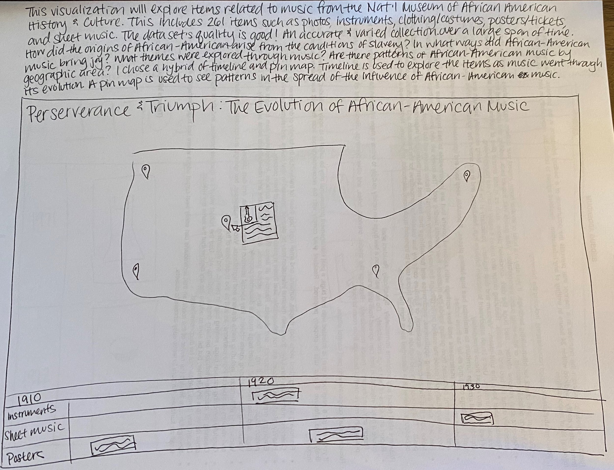
This viz will explore items related to music from the NMAAHC. This includes 261 items: photos, instruments, clothing/costumes, posters/tickets, and sheet music. The data set's quality is good! An accurate and varied collection over a large span of time.
How did the origins of African-American music arise from the conditions of slavery? In what ways did African-American music bring joy? What themes were explored through music? Are there patterns of African-American music by geographic area?
I chose a hybrid of timeline and pin map to explore the items throughout the music's evolution and simultaneously see patterns in the geographic spread of the influence of African-American music.
Sketch #2
This viz will explore clothing items from the NMAAHC. This includes 260 items: clothes, costumes, and accessories from the 1600s - 2010s. The data set is ripe with a variety of themes including slavery, incarceration, sports, activism, entertainment and more.
Could clothing reflect the struggles and successes of African-American lives throughout history? Was clothing worn for protest, entertainment, or utility?
I chose a timeline method mixed with a gallery wall to show the evolution of fashion through a unique scrolling experience (similar to Pinterest or viewing a fashion museum in person) with color-coded keywords.

Sketch #3
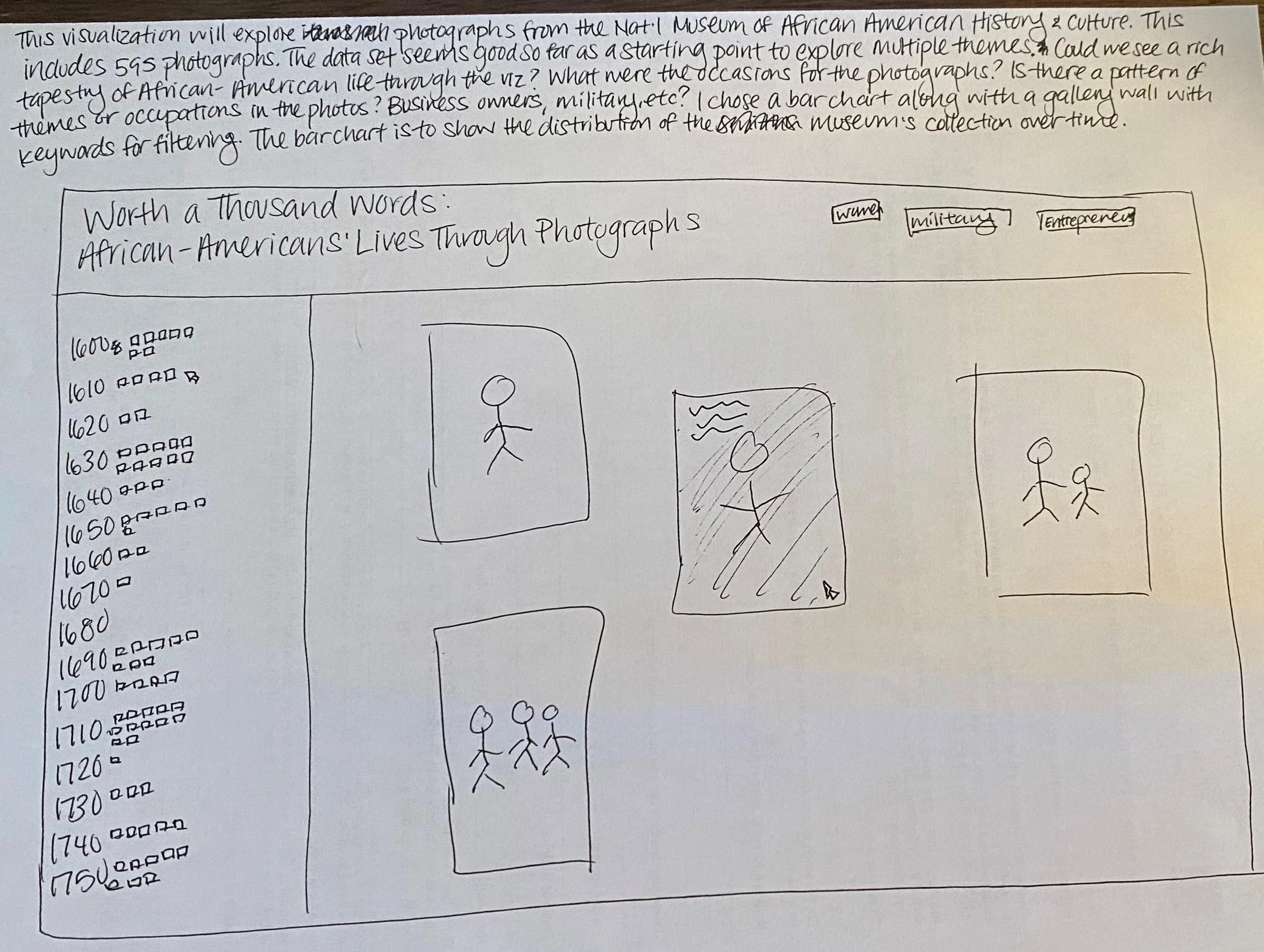
This viz will explore photographs from the NMAAHC. This includes 595 photographs over a large span of time. The data set is larger and a good starting place to explore multiple themes. However, many of these photos are "unidentified" so it would be a challenge to know more backstory to the photos.
Could we see a rich tapestry of African-American life over the centuries through the viz? What were the occasions for the photographs? Is there a pattern of themes or occupations in the photos? Business owners, military, etc.?
I chose a bar chart along with a gallery wall with keywords for filtering to show the distribution of the museum's photographs over time.
I stumbled on a symposium called "Pictures with Purpose" hosted by the NMAAHC that "examines the production of early photographs and the many ways photography of black people was melded into every facet of American life." It turns out that during the abolitionist movement in 19th century America, cameras were becoming cheaper and more accessible to the public. For recently-free African Americans, they were able to take control of self-representation, fight against racist stereotypes, and present their best selves in the public space. Sketch #3 seemed the most interesting idea to further explore.
Design Mockup and Prototype
My main inspiration for the design mockup was Past Visions created by The Urban Complexity Lab at the University of Applied Sciences Potsdam. A couple of key design features from Past Visions stood out to me that I wanted to incorporate into the mockup:
I loved that you could see the entirety of the collection, yet hovering over filters would highlight the associated photos and give you a sense of scale. This achieved both a quantitative and qualitative exploration of the photos.
I also loved that it allowed you to seamlessly zoom into the timeline and focus on individual photos in greater detail.
I really enjoyed letting my creativity freely flow during this mockup phase. However...
Final Quantitative Design, Prototype, and Presentation

... it turns out that the design mockup was a tough coding challenge to even get to a working code prototype beyond the bar graph. While it was interesting to see large amounts of photos tagged within the 1860s and 1910s, it was time to move onto the qualitative phase of the course.
Qualitative Project
Concept and Sketches
I wanted to continue working with the same dataset from the quantitative portion. The metadata that I pulled into a JSON file from Open Access opened my eyes to a number of variables I hadn't thought of, so I started sketching out some interesting ideas.

Sketch #1
Title of the visualization (what am I looking at): Bubble Chart of Tag Words
What are questions that you want to explore with this visualization? How have photos been tagged based on the decade they're dated in? What were the most frequently used tag words throughout the decades? Could these words tell a story about the photograph collection?
Which qualitative dataset is used? Photographs from the NMAAHC.
What are the properties of the data set? How many data points, what's the quality of the data etc? Pulling on title, topic(s), and place(s). There are 632 data points. Lots of qualitative data to analyze!
Which visualization method is used and why? Bubble chart to see the frequency of tag words over a time period.

Sketch #2
Title of the visualization (what am I looking at): Highlighted Keywords in Photograph Titles
What are questions that you want to explore with this visualization? What were the most frequently used tag words throughout the decades? Are there themes we could see from within collection over time?
Which qualitative dataset is used? Photographs from the NMAAHC.
What are the properties of the data set? How many data points, what's the quality of the data etc? Pulling on title, topic(s), and place(s). There are 632 data points. Lots of qualitative data to analyze!
Which visualization method is used and why? A chronological list of titles to see the frequency of highlighted words in the overall collection.

Sketch #3
Title of the visualization (what am I looking at): Connections Between Photograph Topics and Places
What are questions that you want to explore with this visualization? Were there certain topics that "took place" more often in certain states? Could we see a relationship between cultural shifts and where they occurred?
Which qualitative dataset is used? Photographs from the NMAAHC.
What are the properties of the data set? How many data points, what's the quality of the data etc? Pulling on title, topic(s), and place(s). There are 632 data points. Lots of qualitative data to analyze!
Which visualization method is used and why? An alluvial diagram to see the flows and connections between topics and places.
Sketch #2 was the most interesting option for a couple of reasons. Mainly, the juxtaposition of looking at a textual analysis of a photography collection seemed unique and my classmates responded to it very positively out of all the options. Additionally, the amount of coding to achieve this would be a good challenge for me yet achievable within the semester.
Design Mockup and Prototype
The coding prototype was a fun challenge. However, I paused in the middle of building this out because I started to question the effectiveness of the visualization. What would viewers learn from highlighting some keywords? Should I provide the filtered keywords? Should I allow users to search their own keywords? If it was beneficial to add photos to this project, how would it fit?

I needed to take a step back and started researching other methods of textual analysis. I came across Jason Davies' famous Word Tree, which inspired me to consider doing the same. I was worried about the amount of coding I needed to learn in a short period of time until I found AnyChart, a set of JavaScript libraries that creates data visualizations more quickly.
Final Qualitative Design, Prototype, and Presentation
The interactivity with AnyChart immensely helped me save time with coding! I was really happy with the way the prototype turned out. The next challenge was to finetune the narrative and incorporate interactivity into this project. It kind of felt like I was finally breathing life into this!
Interactivity Project
Concept and Sketches
We were given some questions in order to help us reflect and decide on the best interactive approach to our projects.
What are questions that you want to explore with this visualization? How did African Americans want to present themselves with early photography?
Why are you creating an interactive/narrative version of it? To enhance the viewer’s exploratory experience with a gallery in addition to the text analysis.
What will narrativity and interactivity add to this project that was not possible in static form Adding interactivity allows viewers to simultaneously explore the gallery in a traditional and non-traditional way.
Which dataset is used? What are the properties of the data set? How many data points, what's the quality of the data etc? 621 Open Access photos from the NMAAHC.
Which visualization method is used and why? Word tree is used to show a unique way to explore the photography collection.
I knew I wanted to incorporate photos into the project. I dreamt big and imagined a gallery alongside the word tree. As you narrowed down the word tree, the gallery would also narrow down until you clicked on the final phrase and see the resulting photo.
Design Mockup and Prototype
It turns out that trying to customize an AnyChart word tree is really really difficult, but I was determined to make it work!
I updated my design mockup to incorporate more context and to present a richer, more elegant user journey. I had the idea of photos floating around when the user first loads the page, kind of teasing them to explore!
It took a lot of testing and coding to have photos finally appear (yay)! Styling the website was the most fun part of the project, especially the floating images and working with parallax scrolling 🙂 After many many iterations...
Final Design, Prototype, and Presentation
Link to Worth a Thousand Words
Feedback
Sonoe (Smithsonian staff): I appreciate the close reading aspect of this project -- like the words as a corpus or individually can give you these clues about the African American experience. I also appreciate that the examples (and maybe that's b/c of NMAAHC's collection) serve as great counter examples of what the country may think of as African American life.
Steven (Smithsonian staff): At first, I was worried that users would be frustrated with completing the sentences, but I ended up loving the idea that they're "rewarded" with a photo.
Effie (Smithsonian staff): I loved the slicing and dicing of the titles. It reminds me of poetry magnets on the fridge. I could see this being an educational tool that provides a rich interface.
Steven (Smithsonian staff): The value of this minimalist design is great. This has the space to have poetic possibility. I would love to have seen more of the process incorporated into the visualization.
Katie (Smithsonian staff): This is an interesting visualization. An interesting thought is the juxtaposition of the titles versus what the photographed subjects intended to self-represent.
Richard (associate professor): An interesting next question to explore is an analysis of the photographed and the photographer.
Mike (Smithsonian staff): It'd be interesting to do an analysis on action words.
Stephanie (Smithsonian staff): I noticed that there are a number of photos' titles include "unidentified". I wonder what kind of analysis could be drawn from that aspect.
Yann (classmate): Fascinating and rich topic and what a creative solution to explore text + images simultaneously. What a playful way of exploring or shedding light on this important theme, and a great way to pay attention to how this topic is recorded, archived and documented. It really invites the reader to consider more carefully how archival content is managed overtime. I also appreciated learning about how you explored how your research journey was mirrored with your different design iterations.
Yoana (classmate): I like the idea of a “reward” at the end of the word tree nodes and how the focus remains entirely on the textual visualization. The minimal use of UI elements also helped emphasize the underlying data, while providing all of the functionality users need. I actually really enjoyed how uneven the bar chart is, as it highlights the diversity of the data you work with.
What I Learned
This was the most challenging project I had done at this point and I'm so thankful for this journey! I'm wildly passionate about using data and technology for social good, whether that's bringing awareness to important issues or inspiring calls to action. I've learned tons about coding, design, and project/time management mostly as a one-woman show but it wasn't without the guidance of Professor Daniel Sauter and the support of my classmates... thank you so so much!