Decoding Everything Everywhere All at Once
May 2023
“Decoding Everything Everywhere All at Once” was my thesis project at Parsons. The inspiration came from personal experience of really loving the movie but still feeling confused by the end. When I Google’d, “Meaning of bagels or googly eyes?”, I noticed two issues: (1) There were lots of written articles that analyzed the movie but didn’t include visualizations (2) and most data visualizations about movies usually focus on industry metrics like box office profits instead of a narrative analysis. My project is a visual guide for viewers who want to better understand the movie through my own interpretation.
Type: Interactive website/microsite
Tools: Flourish, AnyChart.js, RAWGraphs, Figma, HTML, CSS, Google Sheets, Notion, Canva
Featured in:
Director Daniel Kwan’s Instagram story
infogr8’s “Best of Data for Everyone June 2023”
Data Visualization Society’s Information is Beautiful Awards Longlist 2023
The Process
Concept Development
Before I even started watching the film, I needed to understand what is involved in film analysis. I began researching film theory concepts like the difference between the three-act and 15-beat screenwriting structures, or what makes semiotic analysis different from mise-en-scene analysis from narrative analysis. I also researched art movements in film history (e.g. surrealism, poetic realism, independent cinema) and film techniques (e.g. continuity editing, studio realism) that were influential to Everything Everywhere All at Once thanks to David Parkinson’s 100 Ideas that Changed Film.
In addition to film theory, I researched other data visualization pieces that focused on one movie or show to see how they approached their project. My main sources of inspiration came from Fluid Encodings’ A Visual Guide to The Big Lebowski, a Parsons paper by Rasagy Sharma and Venkatesh Rajamanickam called Using Interactive Data Visualization to Explore Non-Linear Movie Narratives, and The Pudding’s The Structure of Stand-Up Comedy. What I liked about these three projects is that they focused on complex narrative structures, which made Everything Everywhere All at Once the next perfect case study. I learned that they had to manually collect their data, which makes sense given that most movie datasets that are publicly available focus on industry metrics like profits or ratings.
Research notes
Figma “sketchbook” of inspirations from other data visualizations
I had a solid strategy to start my project: take a narrative analysis approach to Everything Everywhere All at Once by transcribing and timestamping every line of the movie, then add metadata to it to see if there are patterns in the characters, themes, structure, and universes. I used Google Sheets to create my primary dataset and also because it wasn’t going to be a large dataset that needed complex programming like SQL. Metadata included which character was speaking, to whom they were speaking to, which universe they were in, and even a sentiment analysis score using ChatGPT and Google Colab following this tutorial.
A lot of thought and background research through numerous interviews and articles went into doing a traditional academic film analysis of the Everything Everywhere All at Once. In fact, my thesis paper is 90 pages long! The big takeaways:
Characters: The director duo, Daniels, created characters that were more complex and multidimensional than just being “good” or “bad”. Daniel Kwan explains, “There’s like tiny moments of careless racism, careless sexism, careless ageism. It’s all in there and it’s not because any of these people are bad people, it’s because they don’t have the time to fully look at each other and say, ‘You’re a human being who contains multitudes.’”
The film isn't about a battle between "good vs. bad" people. The focus is about complicated relationships in the Wang family, which make the characters feel lonely. What makes the Wangs' story powerful is their ability to change and become more kind to each other.
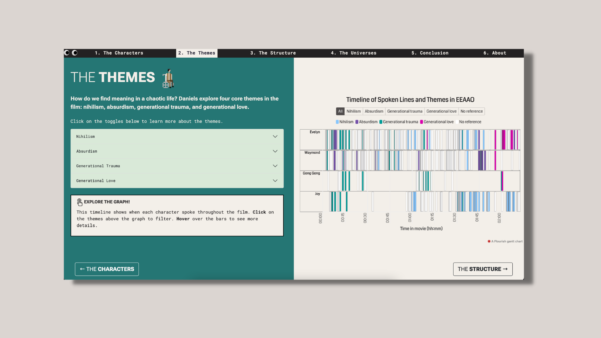
Themes: How do we find meaning in a chaotic life? Daniels explore four existential core themes in the film about: nihilism, absurdism, generational trauma, and generational love.
Structure: Even the craziest of movies like this one can actually be organized like an essay into a 15 beat screenwriting framework. Daniels combine this structure with a Japanese storytelling concept called Kishōtenketsu. Daniel Kwan explains, “Rather than the conflict pushing the story, the story is full of changes in perspectives.” Daniel Scheinert added, “I was obsessed with Princess Mononoke for the longest time… Mononoke is much more morally ambiguous. They’re trying to negotiate peace as a climax to a fantasy film, which is how we steered our film."
Universes: The multiverse concept is a common plot device in superhero movies. Everything Everywhere All at Once uses the multiverse as a philosophical issue in the story. Every choice Evelyn makes in her journey through the multiverse keep raising the stakes in her relationships.
Daniel Kwan explains, “The frustrating thing about them [multiverse narratives] is that no one is willing to go to the logical conclusion, which is infinity. If every single choice branches off into another universe, there should be an infinite number of universes, which means narrative doesn’t matter; choices don’t matter. Why should you care at all?”
Design Development
With the data collection complete, I used RAWGraphs to see quick visualizations of the data and to test different visualization types.
The thesis project underwent three major wireframe iterations using Figma. The first wireframe focused on testing initial visualizations and initial web design ideas including incorporating color, some rough content, and playful elements as a nod to the movie.
Next, a few Pinterest boards (1, 2, 3) and Notion were used to gather more inspiration for overall color palettes, aesthetics, and textures. Since the film has been described as maximalist, the project began to explore maximalism within web design: big bold text, bold clashing colors, and fun UX elements.
This led to the second iteration of wireframes where each of the four focus areas (characters, themes, structure, universes) had a dedicated page with its own theme like how Everything Everywhere All at Once switched between different genre styles. The second iteration also explored UX elements, started to solidify the content, finalized the data visualization chart types for each chapter, and really experimented with how to incorporate a maximalist style in a nod to the film. The issue was when applying the maximalist aesthetic to the wireframes, the wireframes became too overwhelming as the data visualizations also became more complicated.
The third iteration became the grounding foundation of the website’s final design. With the content finalized, the focus for this iteration was to finalize the color palette and typography. The color palette was adjusted to be simpler yet still bold where each chapter had a distinctive feel without changing too many elements. The color palette was also a subtle nod to Evelyn and Waymond. The typography was narrowed down to a pairing of Roboto Flex and Roboto Mono. The decision behind this choice was inspired by maximalist websites that used variable fonts that were playful but still tasteful. With Roboto Flex and Roboto Mono, the right amount of playfulness was added to the overall design without the fonts being too wild. Overall, the project’s color palette and typography evolved where there was a balance between maximalist inspirations and a minimalist approach, ensuring that it was bold but not overpowering the data visualizations themselves. Accessibility was also a priority, focusing as much as possible on having enough color contrast and larger font sizes using VizPalette.
The UX was heavily inspired by The Pudding’s “The Structure of Stand-Up Comedy” because their approach to data stories and the narrative analysis was the closest fit to the thesis project: aimed for a general audience focused on pop culture. Instead of a scrollytelling format, a “stepper” or step-by-step approach was used, which was the same approach as The Pudding’s as mentioned in their process video (The Pudding, 2018). It was a better approach given that each chapter of the thesis project had distinct visual identities and the data visualizations were dense, so having a hand-holding approach could give users a sense of guidance along each chapter with less user interaction needed versus a scrolling story.
For the layout, a side-by-side format was utilized in order to balance the visualizations and the content. If the visualizations took up more of the screen, it could potentially shorten the amount of context needed to understand the visualization. However, if there was too much content, it could make a less-than-ideal user experience. The Pudding’s “What makes writing more readable?” was an inspiration in aiming for more simple concise content for a better user experience in terms of readability and accessibility. The Pudding’s “Get out of your geographic music bubble” was also another inspiration since their content was concise without losing the essence of their project topic.
Given the playfulness of the movie, the website incorporated fun elements such as pixel art and GIFs. The Pudding’s “30 Years of American Anxieties” and “The Musical Diversity of Pop Songs” were the inspirations as both used illustrations in a playful way that did not distract from the main content of the website. Additionally, because the visualizations were built with AnyChart.js and Flourish, customizations were limited so GIFs and pixel art were the easiest way to add playful elements. In order to create pixel art, screenshots from the movie were pixelated to narrow down the color palette. Then Piskel was used to create the spritesheets which turned into GIFs for the website (see pictures below).
With the time constraints of the thesis project, all data visualizations utilized low-code and no-code tools, AnyChart.js and Flourish. The rest of the website was coded using HTML, CSS, and JS. No framework was used since the learning curve would require more time for me. ChatGPT was heavily used in creating the website but only as a debugging tool or as a tutorial for structural elements such using Bootstrap and div elements to create a page with two sections side-by-side or vertically centering content. ChatGPT was strictly not used for content creation, it was only used to provide a basic coding structure to build upon.
Screenshot from film
Screenshot pixelated
Color palette narrowed down
Custom-made pixel art GIF
Final Project and Presentation
Presentation video created using Canva

Instagram post created using Canva
What I Learned
This was the third time I’ve created a microsite while studying at Parsons and this thesis project was the most confidence-building experience I’ve had. Coding has always been a steeper learning curve for me than my design skills, so the ability to use ChatGPT for getting a coding framework started plus for debugging and to use Flourish to more quickly build beautiful interactive visualizations was a huge help. Both tools allowed me more time to focus on my research, content, and design/UX of the website. While I have experience building dashboards and I have an interest in data journalism, I also really enjoy ideating and creating non-conventional data visualizations. This was the first time I’ve focused on pop culture as a topic for a data visualization project and I can see myself wanting to do more projects like this in the future. Overall, I’m really proud of this project and I’m happy with how the research, design, and code came together. Honestly, I had the most fun with this project 😁