GIS for International Crises, Development and the Environment
January-May 2023
I took a course at Parsons called GIS for International Crises, Development and the Environment (NINT 5380) that was an introduction to cartography and spatial analysis using GIS tools. Over the course of five months, we created eleven different maps along with a final project with the guidance of Stephen Metts. This was one of my favorite classes and I’d love to continue learning GIS! I’ve listed all my GIS work below. More details can be found on my Notion.
Type: Static maps
Tools: QGIS
The Assignments
Assignment 1 was a basic introduction to creating maps using QGIS including how to correctly load .shp data, change the design of the country administrative features and points, alter the coordinate reference system (i.e. the ‘Map Projection’), and add a map legend.

Assignment 2 focused on acquiring, cleaning and mapping data as Lat/Lon points features. The goal was to filter through the NYC 311 dataset, pick a dataset with 1,000-2,000 datapoints, then visualize the results both in cartographic and chart outputs. After downloading the complaint dataset as a .csv file and positioning it on top of the borough boundary .shp, I used QGIS’ Count Points in Polygon and Field Calculator tools to calculate a total count of complaint records per borough. To create the chart, I used the Data Plotly plugin and embedded the graph onto the map.
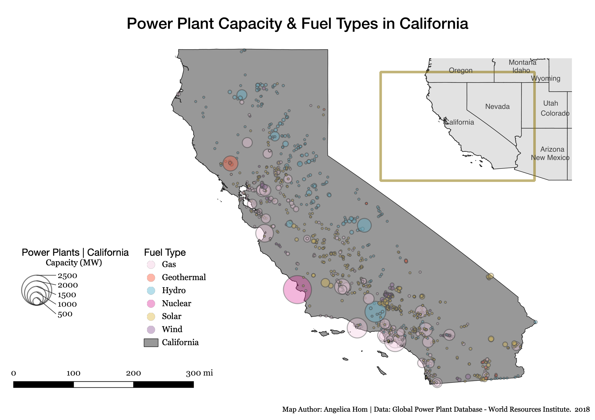
Assignment 3 introduced cartographic design principles, symbolization, working with nominal versus continuous data types, and thematic mapping. The dataset used was the Global Power Plant Database v1.3.0, which is open and accessible at WRI. The assignment emphasized the distribution of global power generation across both type (nominal) and generation capacity in megawatts (quantitative). I learned how to create new map features such as how to categorically and proportionally symbolize data, a scale bar, and an inset map.

Assignment 4 continued with thematic mapping with a focus on using US Census data, specifically a demographic variable of our choosing from the American Community Survey 2020.

Assignment 4 had an extra credit portion that continued using the American Community Survey 2020 but further narrowing down our demographic variable to the age + sex data table of our choice.
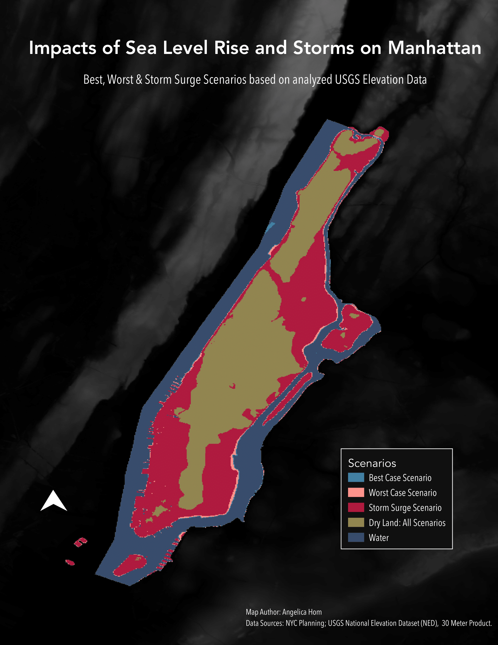
Assignment 5 introduced how to map with raster data. We analyzed how vulnerable Manhattan could be to various scenarios such as sea-level rises and storm surges caused by the global climate crisis using the USGS 1 arc-second DEM Product. How much of Manhattan will be inundated by rising sea levels by 2100? How much of Manhattan is at risk of a 10 m (30-foot) storm surge? I took two USGS DEM raster tile coverage for Manhattan and ran a series of conditional statements with the Raster Calculator to isolate raster cells that met different scenario criteria:
Which land is already underwater (elevation ≤ 0 m)
Which areas will flood under a best-case scenario (BCS) (≤ 0.28 m)
Which will flood under the worst-case scenario (WCS) (≤ 1.12 m)
Which will flood under an extreme storm surge (≤ 10 m)
Which is safe from flooding under all scenarios (> 10 m)
Using the Field Calculation to get areal calculation for the total land area and land areas for each scenario, I was able to find answers to the two scenarios. The best case scenario is that 7.3% of Manhattan’s land mass would be inundated by 2100, while the worse case scenario would be 10.3%. More than half of Manhattan (54.37%) would be at risk of a storm surge scenario.

Assignment 6 combined the use of vector and raster data to analyze the different kinds of land cover of a global city of our choice that met the criteria: (1) a very large city (2) multiple land uses in addition to high urban surfaces (3) falls within 1 UTM zone. The vector data was obtained through OpenStreetMap and Overpass Turbo, while the raster data was obtained through the Copernicus Global Land Cover.
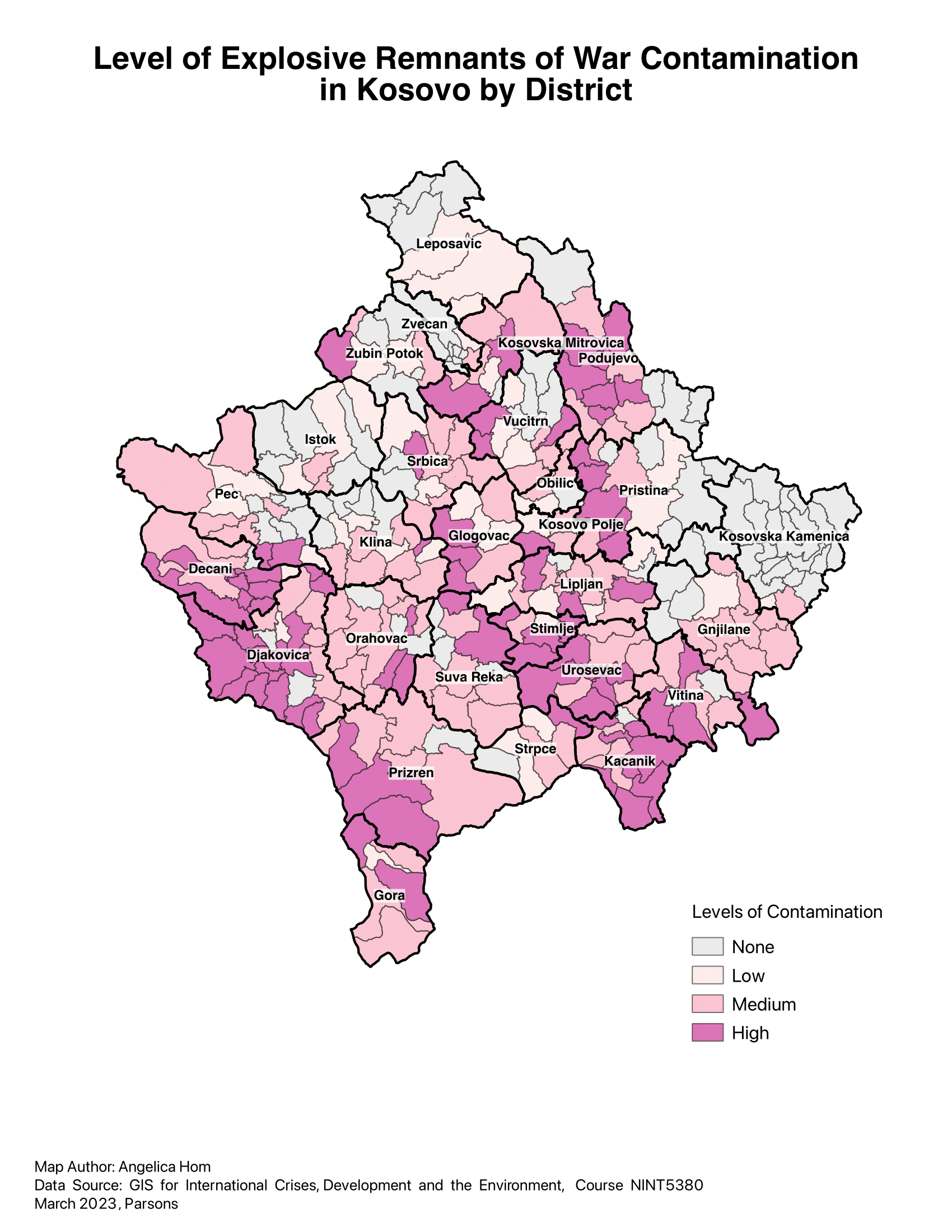
Assignment 7 introduced how to manipulate spatial layers to solve a spatial issue using single layer analysis and overlay analysis. We utilized a dataset representing ERW (explosive remnants of war) toxicity left over from the 1990’s Kosovo War. We created proximity distances to determine varying levels of contamination, a danger to avoid via distance.

Assignment 8 featured raster geoprocessing within a larger suitability model. The focus was to find suitable areas within the Northeastern Indian state of Assam between 800-1,000 acres that meet a series of geographic criteria that are defined on raster surfaces.

Assignment 9 focused on multi-criteria suitability analysis and mapping vulnerability, specifically tornado risks in both the social and physical environment at the US County aggregation. Tornado hazard and vulnerabilities in both the social and physical environment in the United States can come together with tragic consequences. I used QGIS to overlay and analyze NOAA’s tornado path data between 1950 to 2017 as the hazard input as well as the mobile home percentages by county data as the vulnerability input. Then the Field Calculator was used to normalize the tornado count per 100 county miles to create a custom scoring mechanism to thematically map four conditions: high/low tornado incidence, high/low mobile home exposure. Original data sources include Tornado RISK and metadata. By combining tornado hazard and vulnerability spatial data then overlaying tornado paths, we can see a higher concentration of tornado routes in the southeastern counties coincides with higher percentages of mobile home vulnerability and exposure.

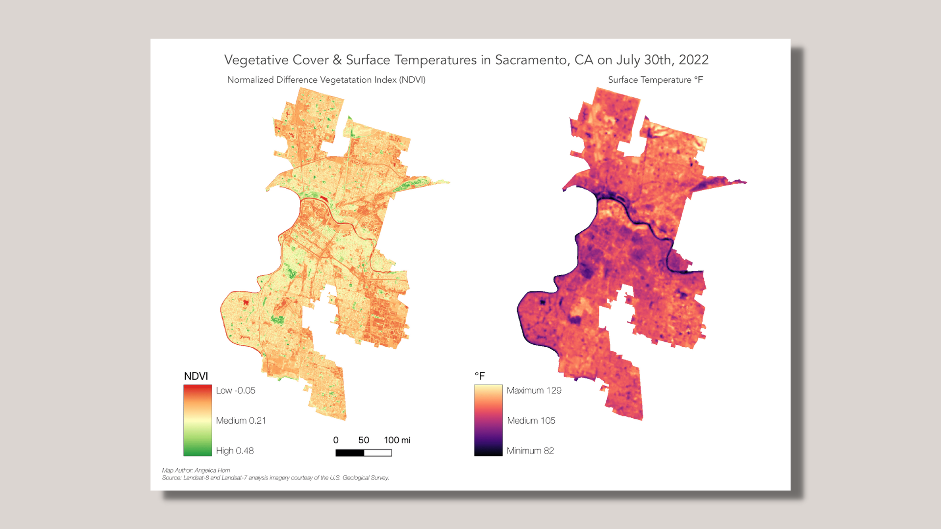
Assignment 10 introduced remote sensing for urban analysis. Specifically, we focused on analyzing rising surface temperature with landcover in a US city of our choosing. The data used was Landsat ARD data using USGS’ EarthExplorer. Then we created a Surface Temperature product to gauge potential urban heat island effect, coupled with a spectral index for NDVI - Normalized Difference Vegetation Index.
From Prof. Metts: “In the era of climate change, there has been significant research into the earthʼs surface temperature, especially in urban areas where socio-economic, landcover, historical urban design all strongly correlate with increasing surface temperatures - often referred to as Urban Heat Islands. Through a socio-economic lens, income is often correlated with vegetative cover in urban areas (Income and Vegetative Cover). Through a historical urban design lens, what is referred to as ‘red liningʼ also often correlates with less vegetative cover (Widespread Race and Class Disparities in Surface Urban Heat Extremes Across the United States).” Using Landsat ARD data for Sacramento on a random summer day (July 30th, 2022), I used QGIS to create a Surface Temperature product to gauge potential urban heat island effect, coupled with a spectral index for Normalized Difference Vegetation Index. When compared side-by-side, spatial patterns consistent across both raster surfaces are evident. We can find areas with higher vegetative cover are consistent with areas of lower surface temperatures, whereas areas with lower vegetative cover are consistent with areas of higher surface temperatures.
What I Learned
This course felt impactful to me as a data designer not having built maps before. Going through these exercises helped me understand the statistical analysis involved in cartography. I thought it was especially useful that these examples were through the context of societal and environmental issues given my strong interest in such issues. I’m really glad I took this course and I’m excited to explore other GIS tools like Mapbox and Carto. I hope that my future projects and opportunities will involve GIS.